
The remarkably efficient White House: a case study and comparison
We’ve designed and seen the construction of many new highly efficient all-electric houses, many of them with photovoltaic (solar power) systems that export more energy than the house will use. While we know that our projects are efficient, questions surface. Just how good are they? How good could they be? These questions are addressed through an analysis of five years of data from the award-winning White House.
The House
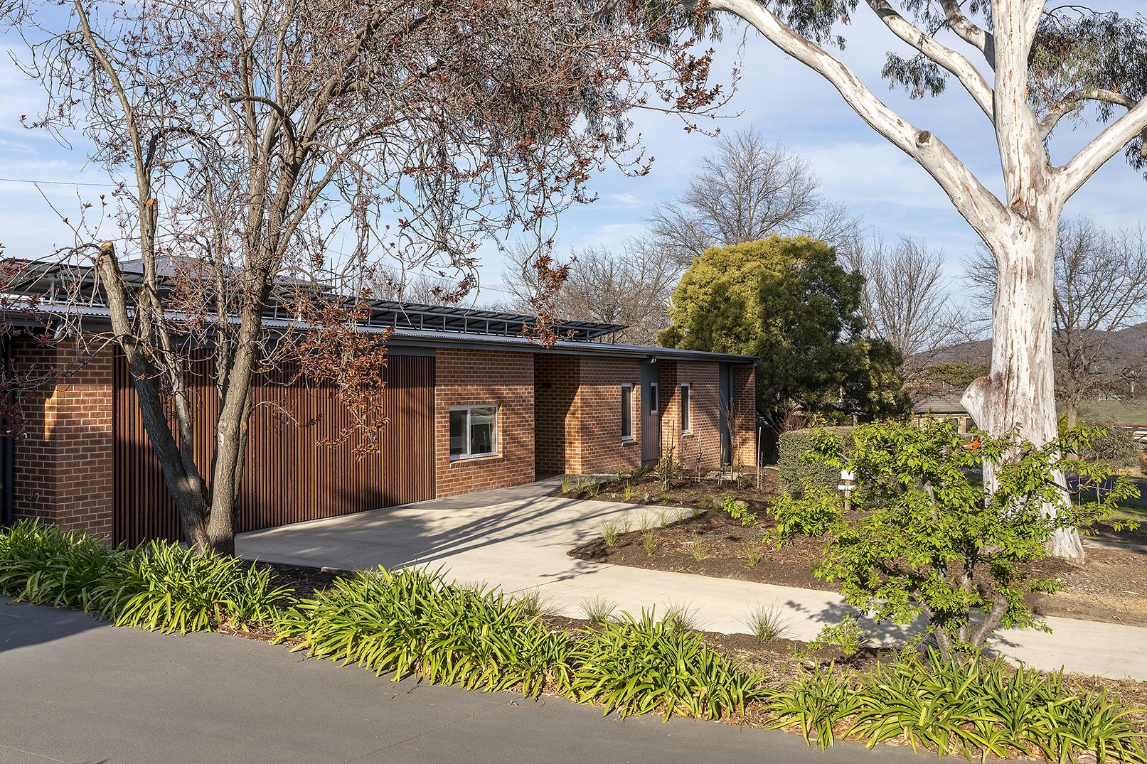
Completed in 2018, White House is a 189 m2, 8.4 star new build. It has housed a family of five since its completion. It is running a 7.9 kW solar system with a 5 kW battery and has a perfect north-facing roof to catch the sun. It won the Australian GreenSmart HIA Award for Energy Efficiency in 2020. In 2021, the family swapped over to electric cars. The environmental, social, and economic benefits of an efficient house running on PV were the motives behind the home’s development. The family of White House now thinks, in hindsight, that they should have doubled the size of their battery and PV system. This would have meant even less energy taken from the grid than the tiny amount they’ve taken to date. The increased upfront cost would have paid itself off in a surprisingly small amount of time.

White House: Photo by Ben King
Beyond their efficient house, the family also makes big efforts to minimise their energy usage. They forgo a dishwasher and a clothes dryer and are happy to put on an extra layer of clothing in winter or lie down on the cool concrete in summer. They only using their ceiling fans when they really need to. Personal electric blankets are used before the AC is switched on. “Winter is supposed to be cold. We don’t expect to be able to walk around in t-shirts all year round” is the approach. (Check out our old 2018 blog about thermal monotony and/or thermal delight which is relevant to this approach).
The home is a great example of a highly efficient house (of good design and standard construction) being lived in by people actively aware of minimising their electricity use. They also have been tracking their energy bills, and their solar panels performance, leading to five years of daily electricity information.
We have collated all the data into some interesting points, and then compared the house to a good idea of a average five-person Canberran home. This case study shows just how far we can take the efficiency of a home and household, including their cars, with real-world, long-term data from a family right here in Canberra. Next time you look at your energy bill, consider how far efficiency has taken this house and what it could do for YOU and your home (remember we advise on retrofitting existing homes too and can get great results).
We split our analysis into before and after electric cars, as they have a significant contribution to the overall energy consumption. The red columns of 2019 and 2020 are before the house had electric cars and the blue are after. This is why the green columns have such low energy consumption.
“Imagine a development of 23 White Houses. The whole suburb would use as much energy as ONE usual house!”
The Data

We know that a table is a horrible way of understanding anything, and we’re sorry if we gave anyone flashbacks to school. Below is some cool information about the house in dot points, to make up for it.
Remember the house has five occupants and is 189 m2!
With electric cars, it exports five times more energy to the grid than it takes out and before them it exported 26 times more!
With electric cars, it on average used its solar panels for 73% of its total energy demand for the year, and without them averaged 92%.
It only took more energy from the grid than it gave back 1/20th of the time, or 3 months out of the 60 months we have data on.
In the home's worst month on record, its solar panels still accounted for 44% of its consumption.
The hypothetical offsetting of the households’ emissions (CO2e/year) with Australian Carbon Credits (ACCUs), at current price would cost about $30 each year.


These are pretty cool snippets, but it’s really hard to appreciate how this stacks up against other houses in Canberra. There are plenty of high performance houses around, but we don’t have enough information to compare them to this case, as we would need real grid consumption (energy bills) along with comparable solar data.
[NOTE: We are in the process of collecting longer term data from more Light Houses — only a small subset have batteries and electric cars as well. Anyone out their in a sustainable home who wants to share their data please go ahead].
Meanwhile, we’ve compared White House to the average Canberran five (or more)-person home from a 2020 government study. This study house uses gas, electricity and petrol, where White House only uses electricity.
The White House family drove 53,000 km between their two electric cars over the three years they had them. For a fair comparison, as the distance travelled necessarily varies between families, I’ve imagined a petrol car travelling the same distance and added that petrol energy to the average Canberran home. All this lets us get a good feel for how an average Canberra home with 5 occupants compares to the White House.
Comparison
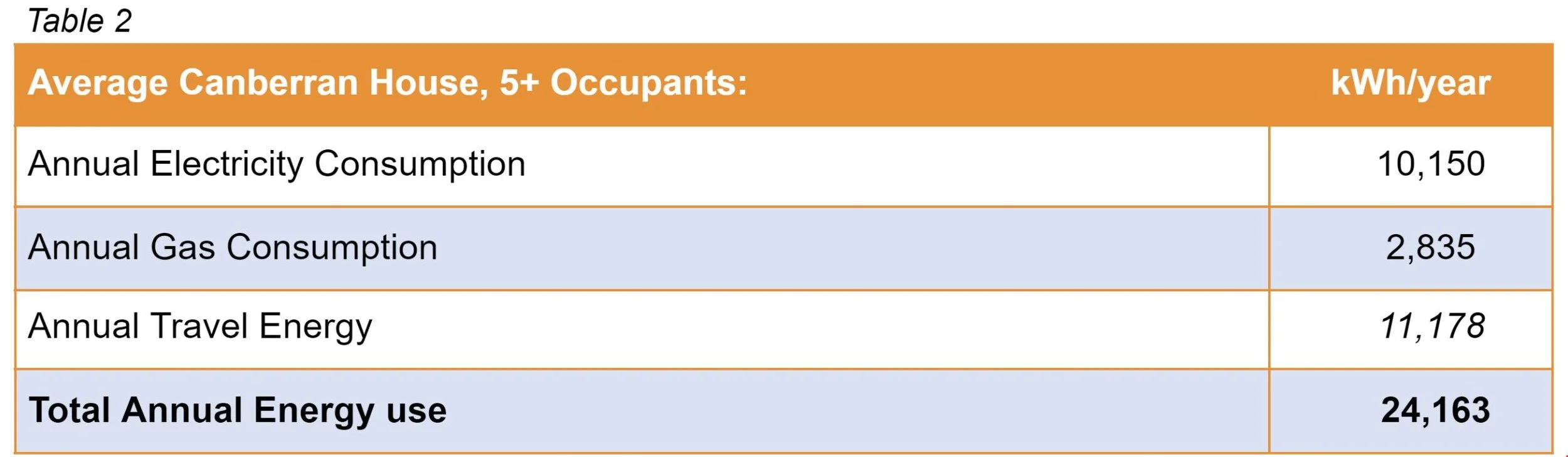
This is as close as we can come to a true average, as it comes from the largest, to date, government survey of Canberra. Many houses from many different areas and ages were surveyed, so imagine this as a big blend of all the 5+ person houses in Canberra. The survey also included solar panels, so they are included in the average electricity consumption. The travel energy uses the White House family’s distance travelled, converted to petrol from an average passenger car, then finally converted to kWh. Finally, onto our comparisons, remember this is a real comparison, plenty of houses use far more energy than the average listed here, and though rare, plenty of households use as little as the White House.
Yes, you are reading that right!
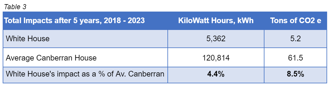
White House used 4.4% of what the average Canberran 5+ person house used over 5 years; cars included. That’s about 1/23rd of the average. This is a truly impressive figure, imagine telling a council that a new suburb of 23 new 189 m2 homes could draw as much energy from society as one standard house.
Below is a chart that visualises that difference, including the cars, gas, electricity, plug loads, heating and cooling, petrol, distance travelled and occupancy.


Total Energy Consumption over 5 years: Gas, Electricity and Petrol Considered.
If we simplify it and only look at 2018 and 2019, before the electric cars, the energy use of White house as a % of the average house drops down to 2.34% or about 1/40th. Check out just how big that difference is.

Home Energy Consumption over 5 years: White House compared to the Average.
Residential construction is still wearing a blindfold about energy efficiency. It is still sitting around thinking that getting to 6 or 7 stars is difficult and costly and probably not worth the investment or effort.
The team at Light House and our smart climate-conscious clients are proving the exact opposite. It is more than possible to reach such high levels of energy efficiency, grid consumption and exported energy with good design and standard construction. White House has proved it.
This case study isn’t unique, Light House has been designing and science-ing equally efficient homes for a long time. Have a look at our Project pages to see them!